
When you’re browsing the web looking for inspiration for your charity website design, you’ll notice that you can broadly categorise designs/layouts into two types: ‘bespoke’ and ‘modular’.
Lots of brand/product sites tend to have a bespoke/custom design, whereas blogs, newspapers and charity websites tend to be a bit simpler and more modular.
Most brand/product sites want something unique, as their website is a huge part of the branding. Once they are designed, they tend not to change much, and if/when they need to do so then they usually have in-house web designers/developers or an external agency to make those changes.
In the case of most charity sites, the content changes a lot more and they need the flexibility to add/remove/reorder their designs in order to reflect what’s most important at that moment. And they usually need to be able to do all that themselves rather than pay for an agency to tweak the layout every week.
There’s almost always a trade-off between having a unique layout/design vs having the flexibility to adapt the design to allow new or reprioritised content.
Bespoke/custom designs
Here’s some examples of bespoke/custom designs (click on them to enlarge):
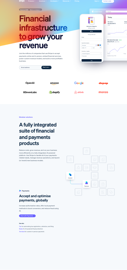
These ones all involve custom animations as well. They stand out from the crowd, but it’s not easy to add something new in without having to re-do the design or layout because each section morphs into the next one.
Modular / generic layouts
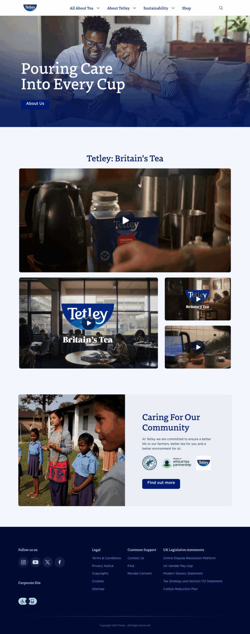
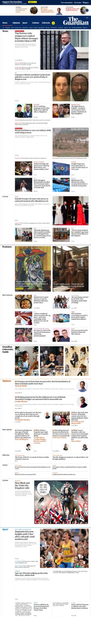
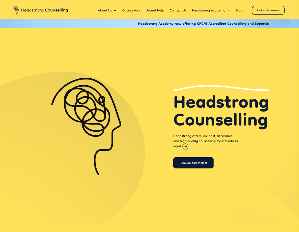
These ones, although they are for big brands, have a modular design. The typography and colour schemes are well thought out, but the layouts are pretty simple and you can see how the site editors could easily move sections up/down or add something new in without throwing the baby out with the bathwater.
Which style should you go for?
If you’re a small/medium charity that has a lot going on, and you don’t have a big budget for ongoing website design support (which, let’s face it, is the position that the vast majority of charities find themselves in) then the more modular/generic design is likely to be your best bet.
If you know that your content is going to change (which is quite rare) or your branding is a really important aspect of your charity, then you might lean more towards something more bespoke. But in most cases I think a small/medium charity is better off going for a more modular style that gives you a lot more flexibility and is more future-proof – even though that makes it look a bit more generic and like most other charity websites.
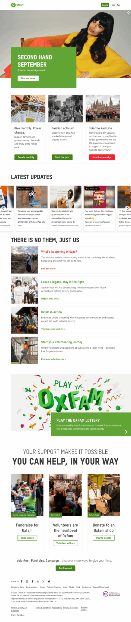
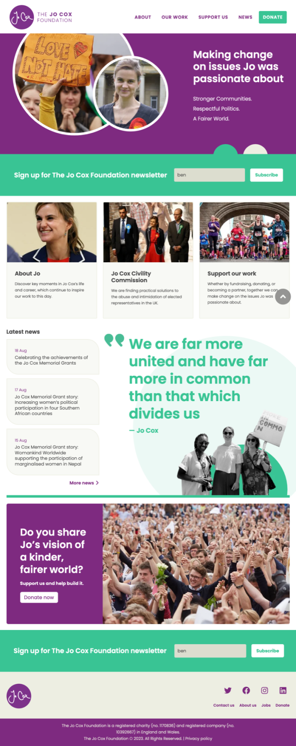
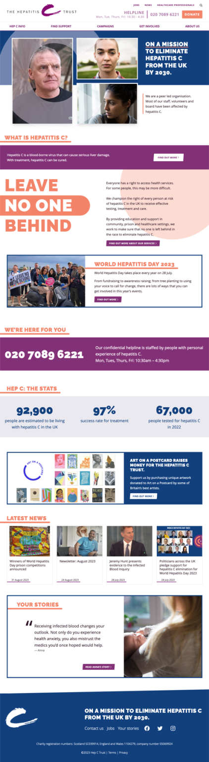
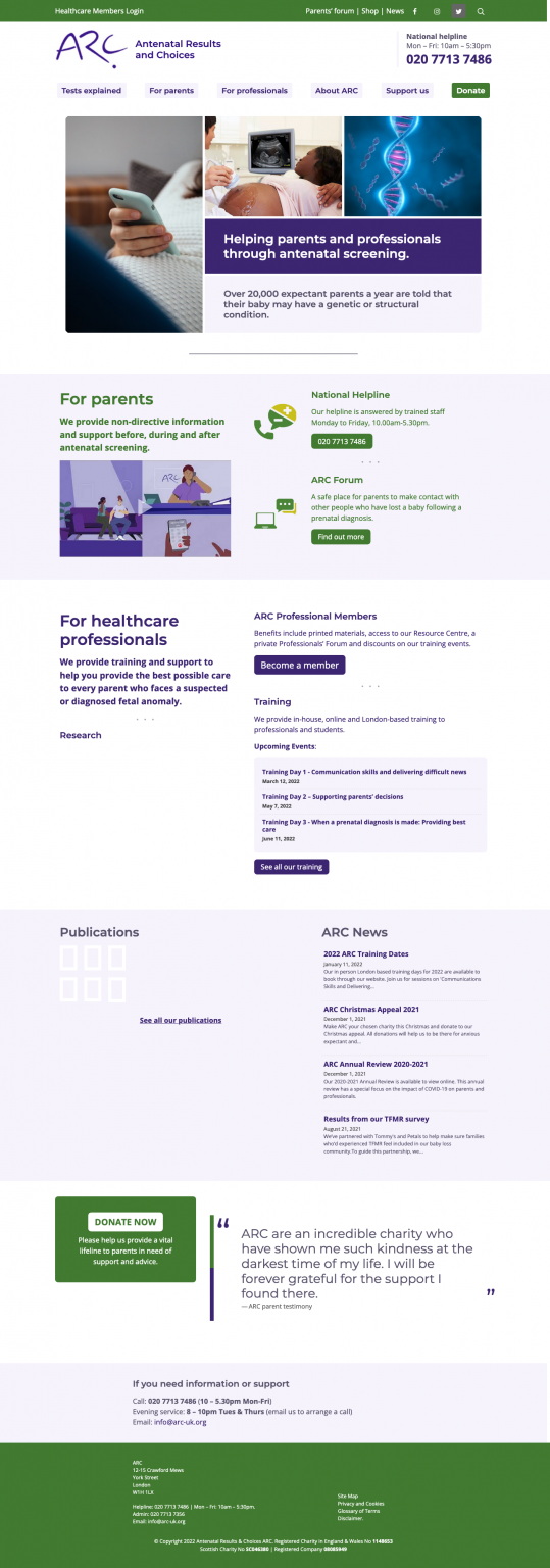
A hybrid approach
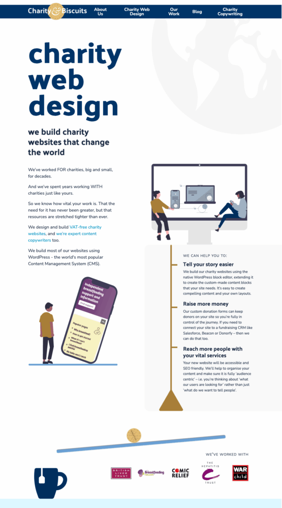
Something you might consider is having a semi-permanent bespoke design element at the top of your homepage (often referred to as the ‘hero’ section) and then a more modular layout underneath. Here’s some examples from the sites we’ve built – in each case the hero section either contains some animation or a layout that you can’t really build yourself using the native WordPress tools. Below it though is a more traditional modular layout and you can easily see how you could rearrange the sections of content or add new ones in.

I’d think of it as a spectrum like this:
More bespoke < ———————— > More flexible
If you look at the design of a lot of the bigger charity websites, I think you’d see that most of them are at the ‘more flexible’ end, so it’s not just an option for those on a small budget. If you look back at the series I did about recreating the Cancer Research, Save The Children, Shelter and Greenpeace sites using just the native WordPress block editor – then you can see how modular they are. If you can build a layout yourself using the WordPress tools available, then you can change it yourself anytime you need to – which should ideally be the goal for most website owners who don’t want to be beholden to an agency to alter their content.
